Confusing User Interface Elements
Too many people are trying to make the web more usable so I thought I’d try the opposite. Below are some user interface elements I designed to confuse, badger, and infuriate users. Enjoy.

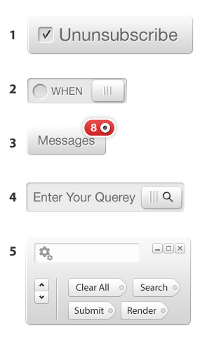
1: The Chutton
Part checkbox, part button. Ideally this will initially present itself in the “checked” state, regardless of user intent.
2: The Boggle
Functions as a regular checkbox, but activating the slider simply covers up the checkbox and label. Avoid action-oriented labels such as OK or YES, and instead use vague language and/or the past tense.
3: The Notifuckation
Displays the number of notifications alongside an active radio button. Clicking or tapping on the radio button immediately marks all the notifications as “read”.
4: The Search & Destroy
A standard text entry field, but the user must slide the search button to the left to submit the form. As the search button slides, it deletes the characters it touches.
5: The Homer
This UI element has everything; pre-populated tags that are confusingly named, 2 scroll buttons, a search field with a settings icon, and Windows controls that do nothing!
I’ve also made the PSD available for download. Please use irresponsibly.