A Brief History of This Website
I thought it would be fun to take a look at this site as it’s developed over the years. Thanks to archive.org, I was able to find some screenshots.
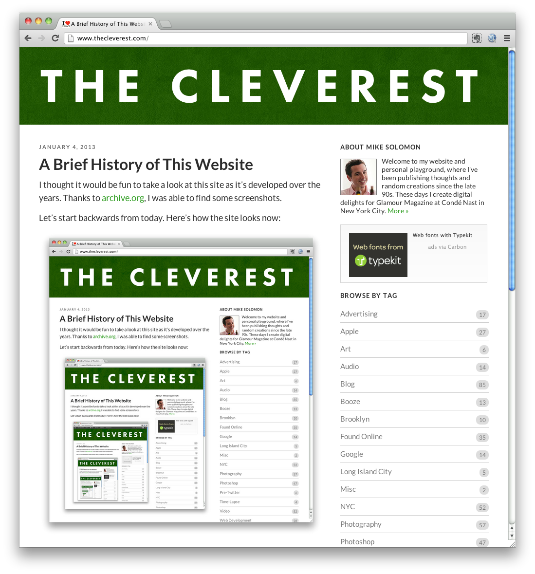
Let’s start backwards from today. Here’s how the site looks now:
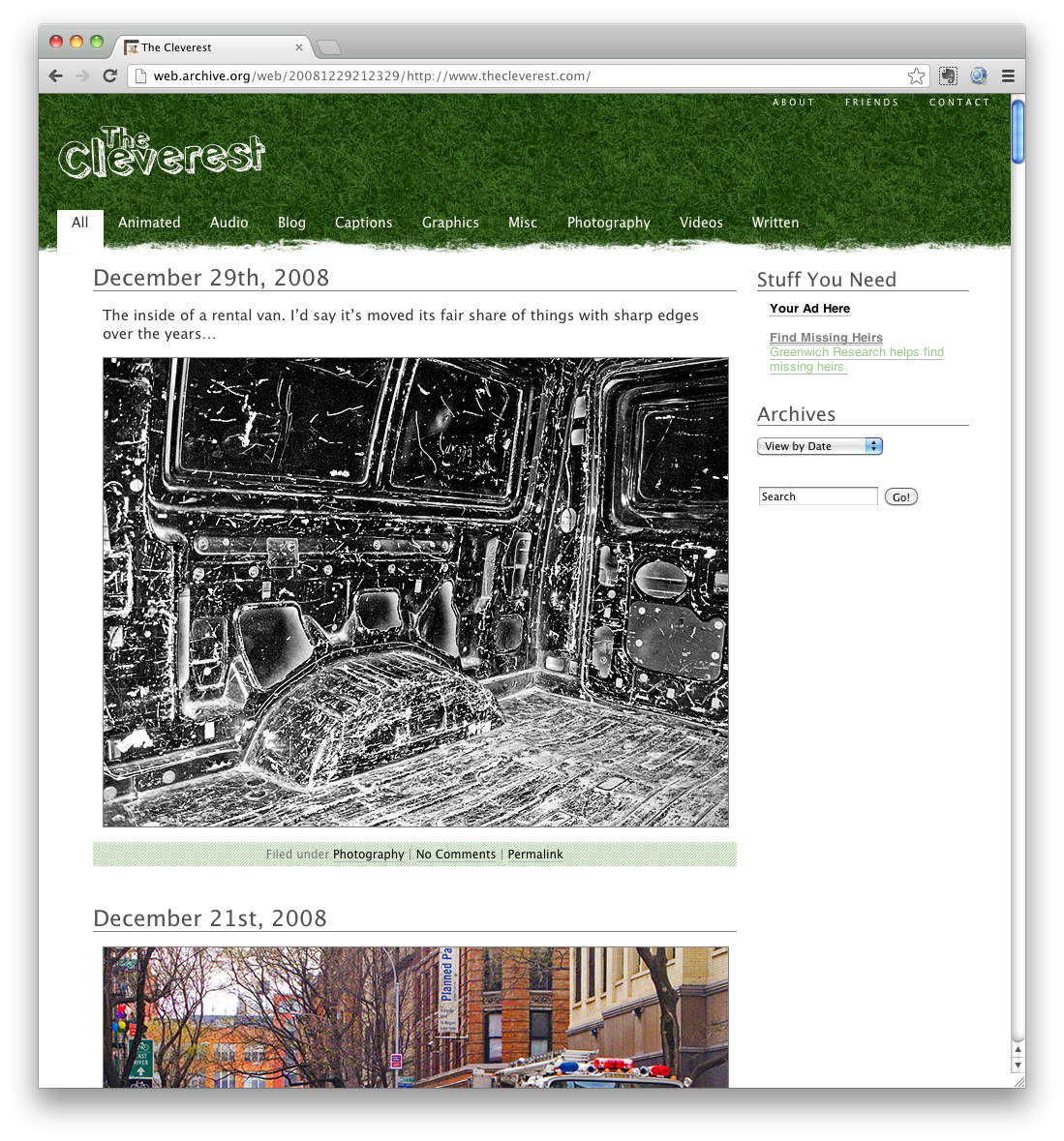
The version before this endured since 2008:
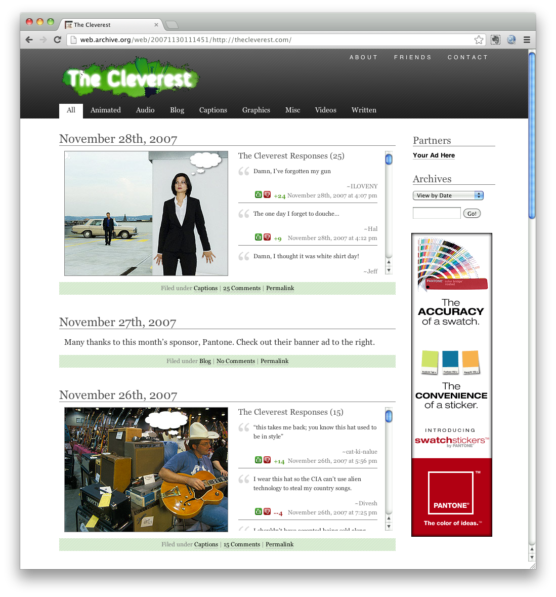
Back in 2007 I was going for a very “2007” look. Note the classic pixel stripe patterns and gradients. Very Web 2.0:
2006 marked the start of the gradients and reflections. I also took some flowery/asterisk patterns from the previous design to add some texture to the top of the site:
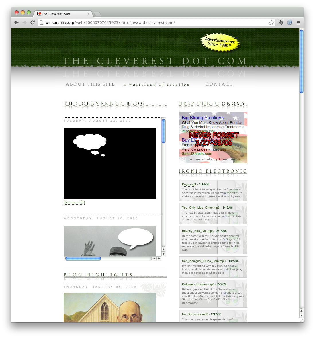
Back in 2004 I was going for kind of a grungy look:
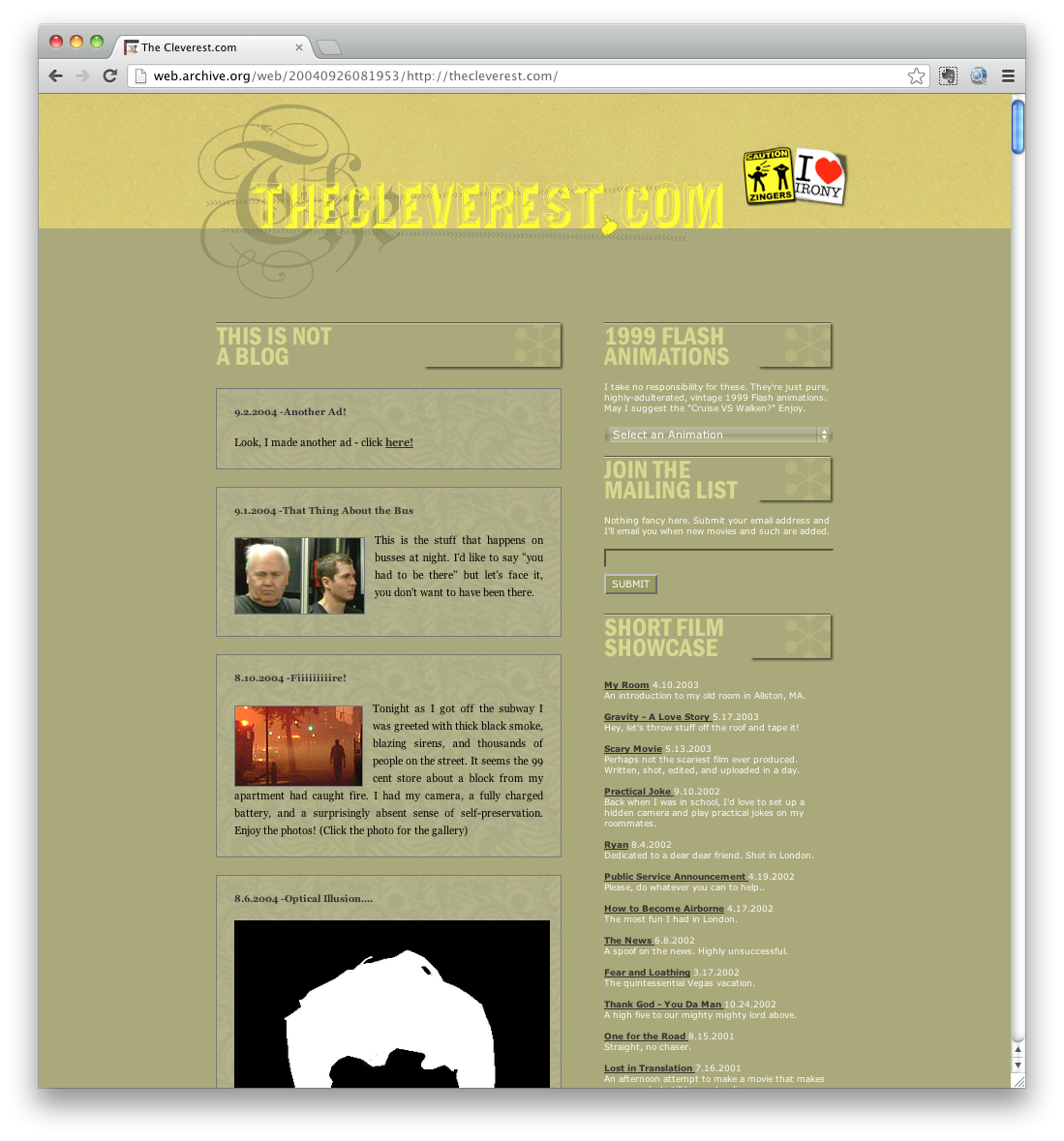
In late 2001 the site looked like a shitshow. Puke yellow and musty orange? Sure, why not!
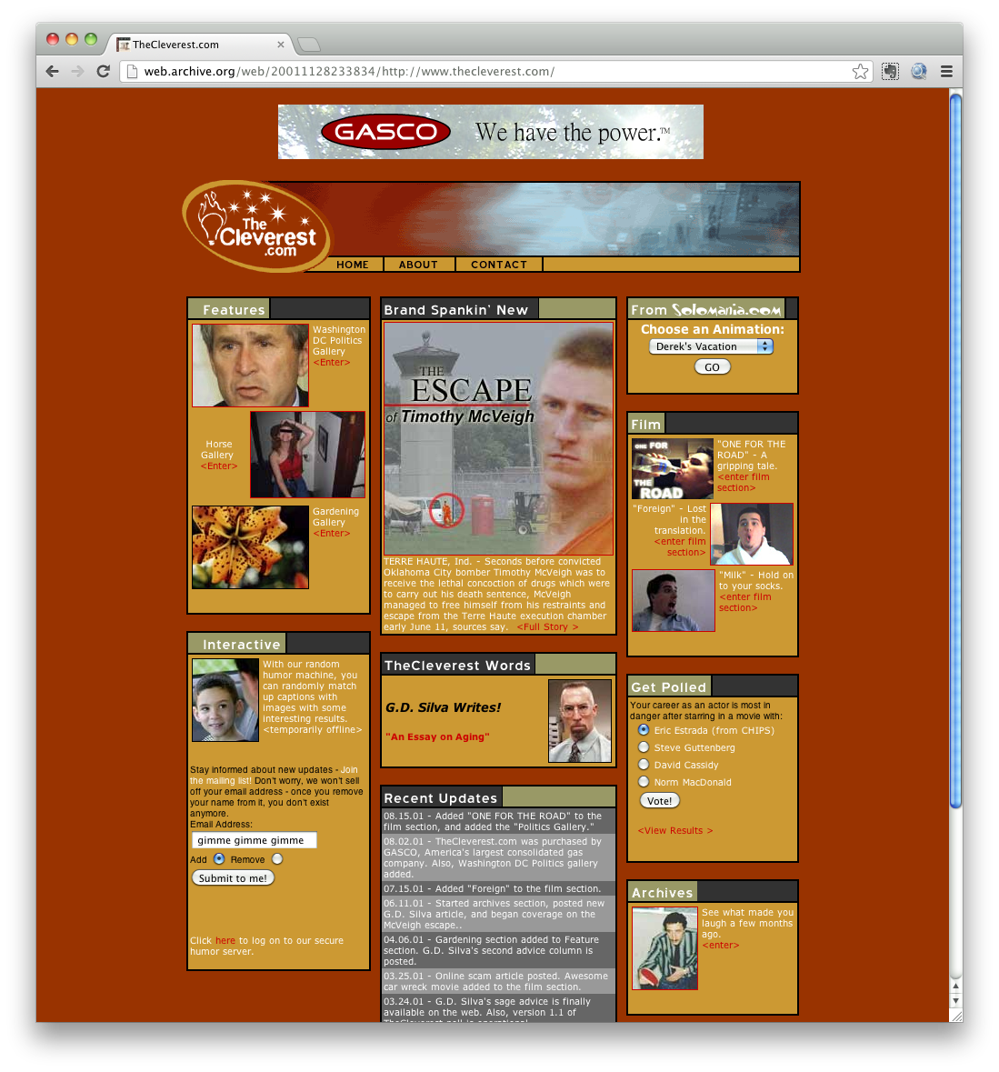
Early 2001: Using images for corners before it was cool, and then not cool.
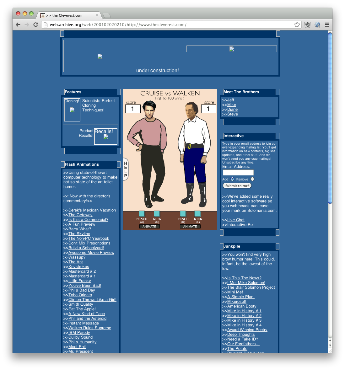
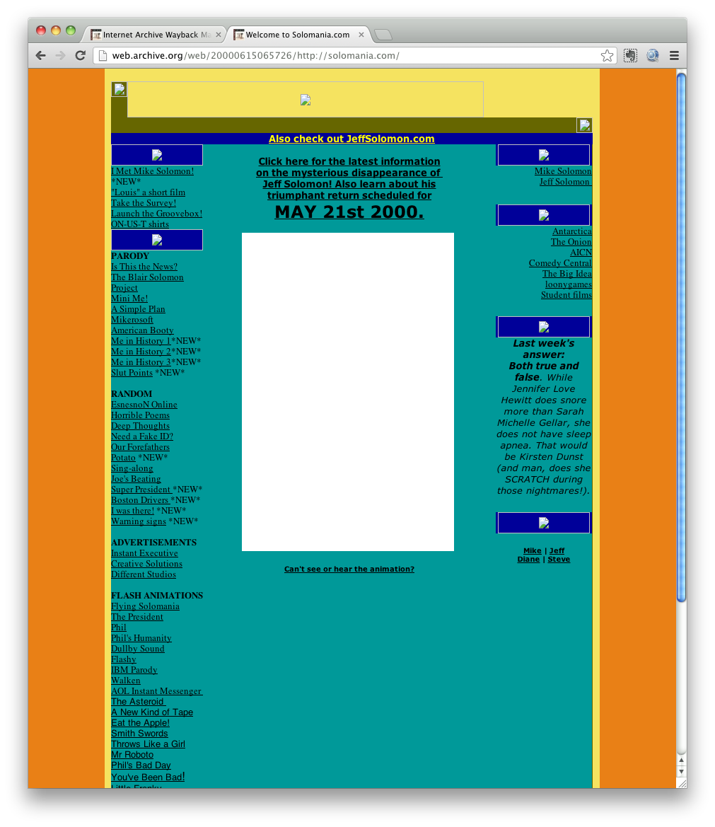
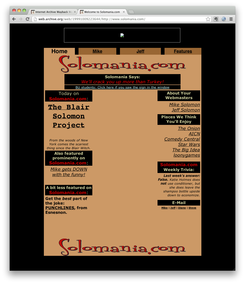
In early 2000 this site lived at solomania.com, which is now my portfolio. Believe it or now, this was a cutting-edge table-based layout.
And from early 2000, here’s the earliest design I have on record. I still remember how hard it was to figure out those colored borders.
