Slim Shots
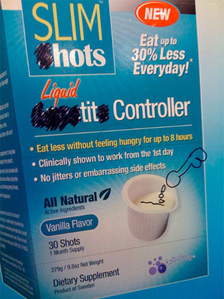
 I saw this little bit of high-brow billboard modification while waiting for the B train in Chinatown yesterday, and what fascinates me is the sheer transparency of the artist’s process. It’s hard to tell where he (and I’m sure it’s a he) began, but in looking at his work it’s easy to decipher his artistic intentions.
“See that cup of white liquid? Well that’s going to need a cock-n-balls right there. And the word ‘Appitite?’ Easy. Now it says ‘tit.’ This is working out GREAT so far!”
My only critique is that I would have gone with “ho” instead of “hots” up top. But I guess everyone’s a critic.
What would YOU have done to enhance this ad? To the comments!