“It” photos and DCF Advertising’s Homeless Campaign
As far as advertising photography is concerned, there are two main types that stand out for me. The first type is imagery that looks pretty much like it did straight-out-of-the-camera (SOC). These are the shots that get the job done and make everyone happy. The second type are the “it” photographs. It’s hard to explain exactly what “it” is, but like the Supreme Court’s definition of pornography – you know it when you see it. These images usually have a slightly hyper-real quality that makes them look “advertising-y”, and are the result of a mixture of complicated lighting setups and skilled time-consuming retouching.
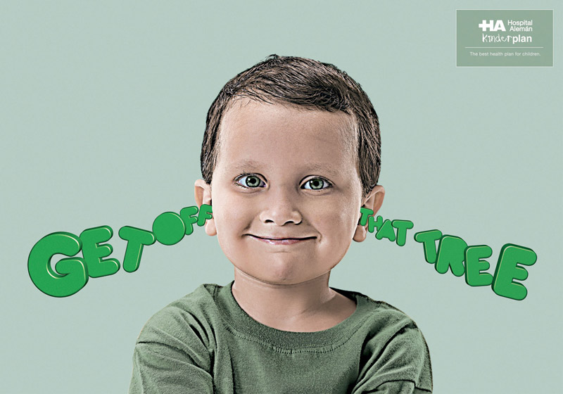
Here’s an example of two ads with similar photography, but one has “it” and the other doesn’t. A Wii ad and a Hospital ad. The Wii ad looks like it was lit by a softbox, which results in a nice, albeit typical, portrait shot of a kid. Everyone’s happy. But the Hospital ad is a bit more stylized. It looks like there are at least 3 lights on that kid (fill, key, and overhead), then in Photoshop the shot got some unsharp masking and channel adjustment. The result is a vivid image that, to me at least, has “it” (even though the background could use some more depth in my opinion). I like the creative concept better for the Wii ad, but that’s a different article.
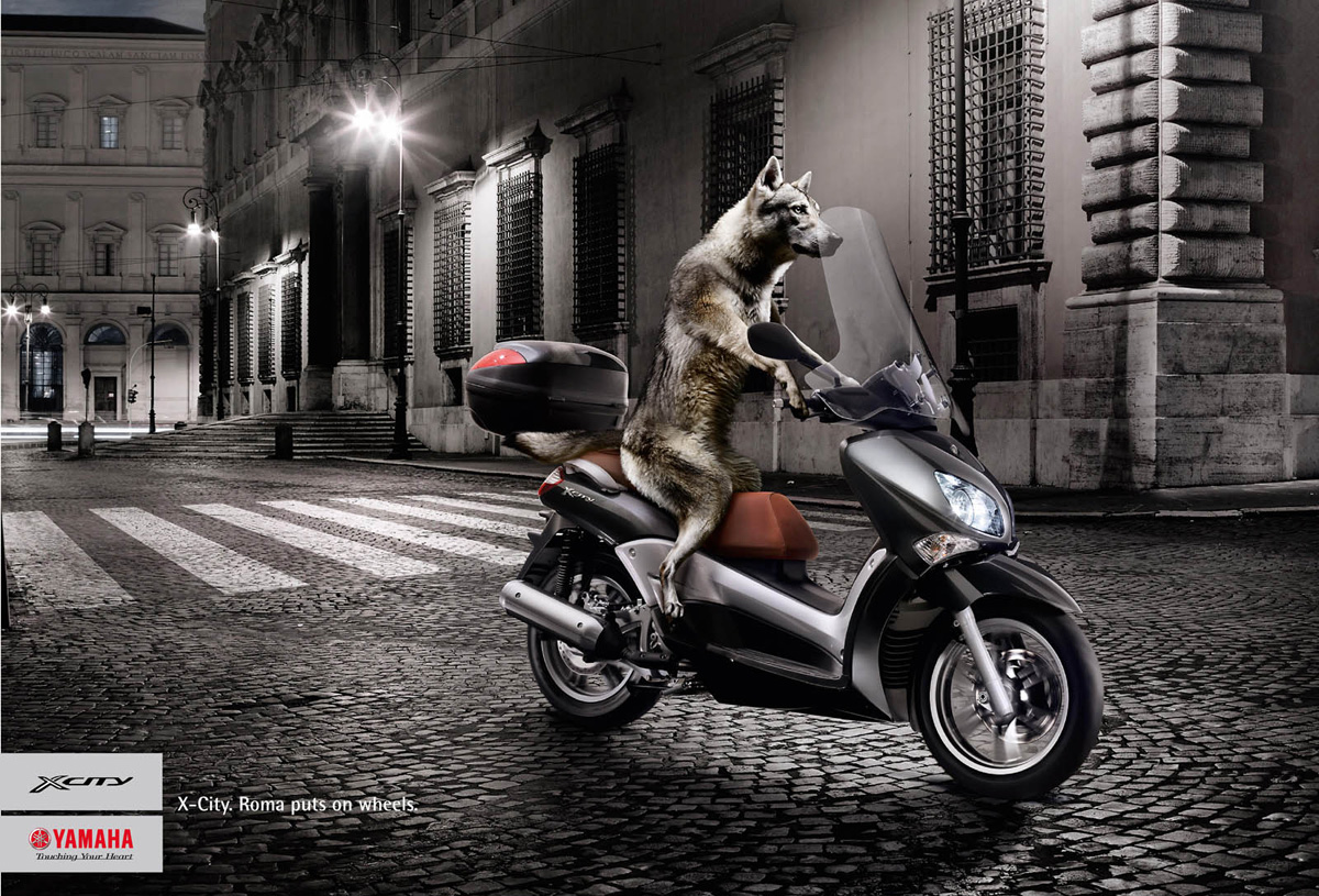
Here are some more examples of “it” imagery. They’ve got a painterly quality to them, and you can tell they used skilled photographers and retouchers (not to mention a talented animal trainer to teach that wolf to ride a Yamaha).
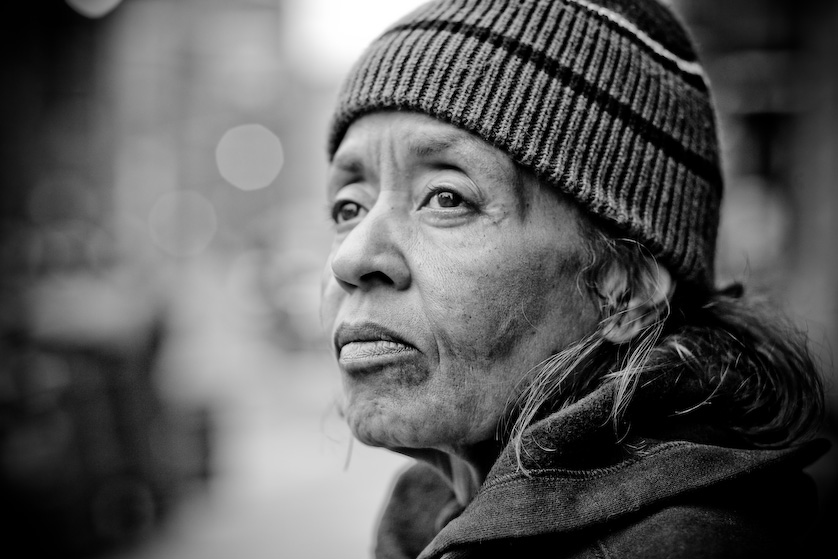
So for a recent shoot for New York City’s latest homeless awareness campaign, I wanted to get “it” style imagry even though it seemed our timeline and logistics were looking like I’d have to settle for SOC images.
Not only did the shoots need to be outdoors, they were scheduled at various times over a 4 day period when our models were sporadically (and sometimes with less than an hour’s notice) available. So unless we could develop a fully mobile, ready-to-deploy, and onobtrusive lighting kit, I was going to have to use available light to shoot this.
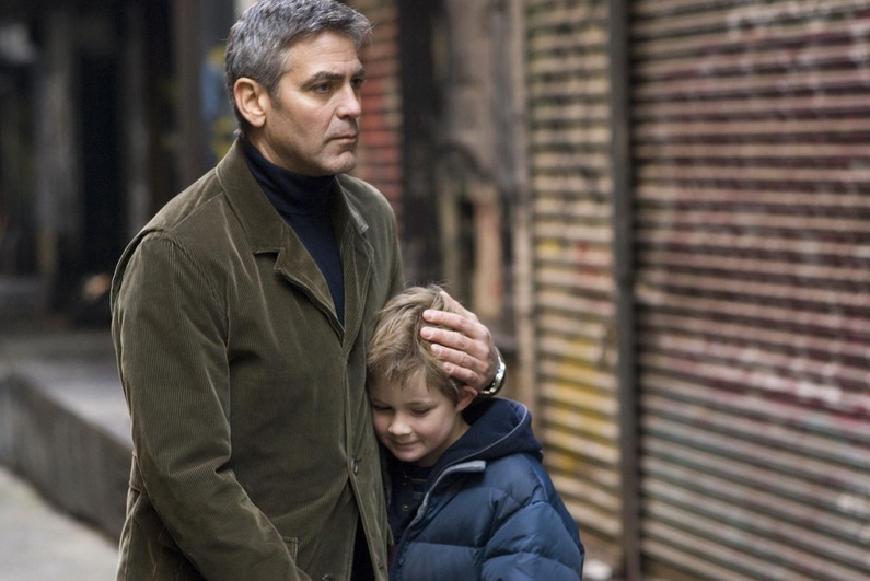
Luckily, since my office at DCF Advertising is in Tribeca, there are a lot of alleyways and open plazas that allow for some great natural lighting. Franklin Place, for example, is the photogenic alleyway where scenes from “Michael Clayton” (like this one) and “The Nanny Diaries” were recently filmed. It’s a narrow alley with tall walls all around and a beautiful strip of open sky at the top that provides a great diffuse overhead light. It also adds sparkle to a subject’s eyes. That’s right – sparkle, baby, sparkle!
So my plan was to shoot using RAW files (duh) and compress the dynamic range using Lightroom (or Photoshop) creating a slightly HDR-looking hyper-real image that would connect emotionally with the viewer, and get as close to “it” imagery as possible.
Below is an example of that process, in the hopes that anyone else in the future can achieve good-looking (if I may say so myself) images with natural light.
This is turning more into a treatise than a tutorial, so hopefully you photographers are still with me. Below is a step-by-step of the Lightroom processes I used to get the look for this homeless campaign, as well as a download of the Lightroom presets I made special just for you.
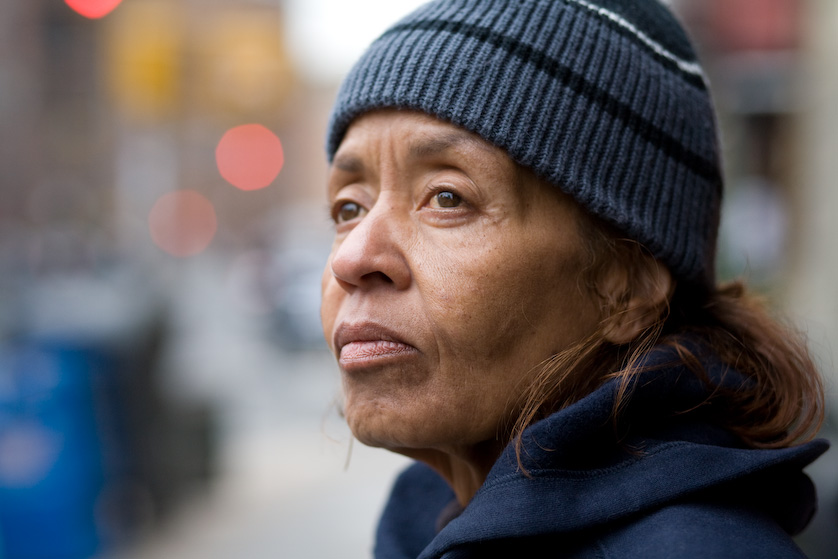
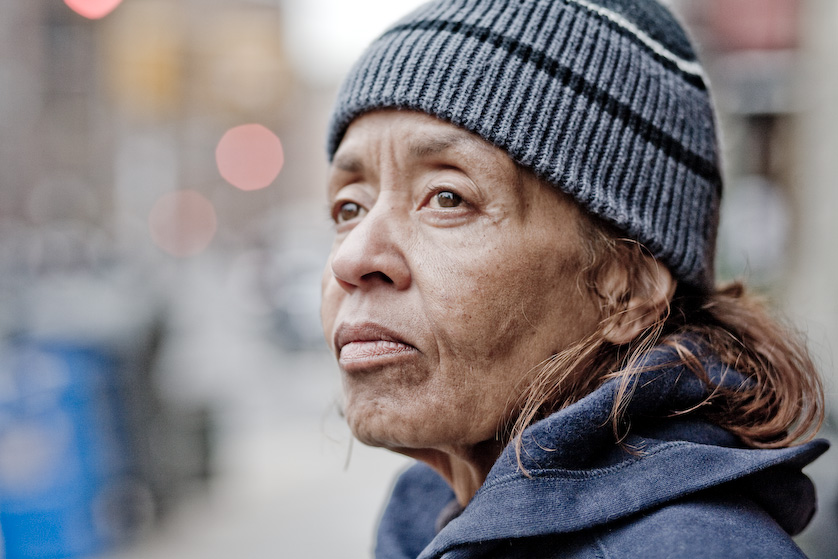
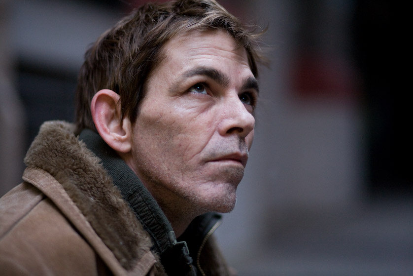
Above is the original photo, straight from the camera. And here are its Lightroom settings. As you can see, it was taken with a Canon 5D and a 85mm 1.8 lens. The exposure was 1/500 @ f2.8 with an ISO of 500. It’s not a bad looking photo, but again, it looks like a photo and not an ad. So let’s play with it.
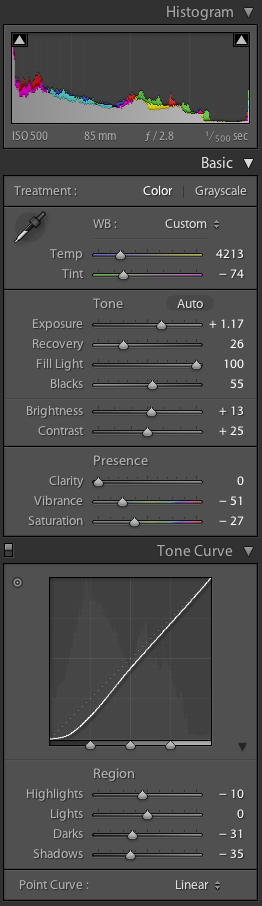
By bumping the “Fill Light” way up and the “Blacks” up to about half, we compress the dynamic range of this 12 bit RAW file into the range a computer monitor can display (which is around 8 bits). This is similar to using Photoshop’s Shadow/Highlight filter, and brings out a lot of the photo’s detail.
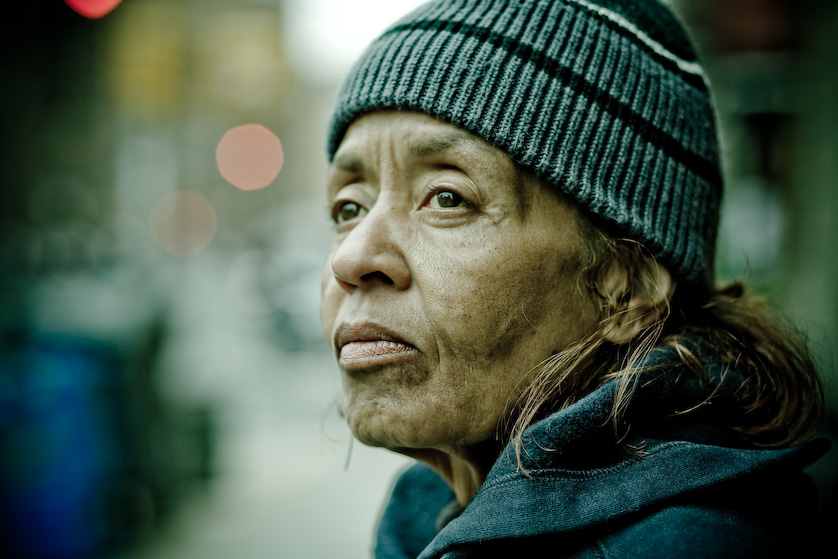
When you make such severe adjustments to an image’s “Fill Light” and “Blacks” settings, you need to compensate usually by decreasing its saturation and increasing its brightness and exposure. Below is the result, and here are the new Lightroom settings.
It’s looking better, but still doesn’t “pop” as ad-folks are known to say. So I added a little more emotion by tweaking the “Temperature” and “Tint” and modifying the tone curve to crush the shadows and increase the contrast. Below is the result, and here are the modified Lightroom settings.
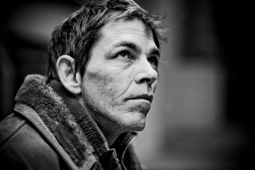
Right about at this time in the creative process is when we found out that the ads would be in black and white. But luckily, this process also lends itself to great looking black and white conversions. Just fully decrease the saturation and you’re done. Below’s the final product (sans some light retouching in Photoshop), and here are the final Lightroom settings.
Here’s another before/after series from the campaign. The setup was slightly different here, and because of the rapidly diminishing daylight I was really pushing the limits of my gear. With the 5D cranked to ISO 1600 and the 85mm 1.8 stopped down only to f2.0, I managed to pull off this shot at 1/60th of a second. These are the times when the 85mm 1.2L wold have really come in handy.
Notice the sparkle in his eyes? That’s from the open strip of sky at the top of the alleyway I mentioned earlier. It’s automatic catch light – very cool.
So that’s about it. Considering the limitations of this project, I’m very happy with the results. Are these “it” photographs? I’m probably the least qualified person to judge, but to me they look pretty engaging, and that’s all I could ask for. As promised, here are the two Lightroom presets as a ZIP file.
I hope this tutorial was helpful. And don’t forget to give the homeless the kind of change they can really use by calling 311.